
I often see people on the Xamarin.Forms forums asking for a carousel-style control. We have the CarouselPage built in, but you can't resize the viewport or easily indicate which page you are viewing. I believe the official documentation even mentions that this control is mainly intended for Windows Mobile.
Thankfully, the power of Xamarin.Forms allows us to build our own.
Thanks to my friends at Firefly Logic and to Michael Watson for inspiring techniques that helped me create this custom control recipe.
The control is similar in functionality to the Xamarin.Forms CarouselPage - except the "pages" can be any type of content.
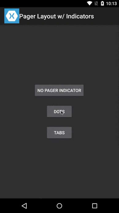
I have examples that show the CarouselView used as:
- A full-page control with no page indicators (like
CarouselPage) - A gallery-style control with dots as page indicators
- A full-page control with tabs as page indicators
Let's take a look at the different components.
Control
Probably the most important piece is the custom Xamarin.Forms control. There's a lot to look at, but I'll try to talk about the important bits.
The control itself inherits from ScrollView. We set the orientation to Horizontal and set the Content to a horizontal StackLayout. This should immediately tell you that the content will display horizontally allowing you to scroll to the parts not on screen.
We manage "pages" of data by creating a bindable IList property as our ItemsSource. Anytime we update the ItemsSource, we add our page items as children of the StackLayout.
We're close!
We should be able to load pages of data and scroll through the pages. What's lacking is that snap into place that we expect when swiping through pages of content. For that, we'll add a Renderer for each of our platforms.
Renderers: Snap Into Place
Our Xamarin.Forms control derives from the ScrollView which means that the native views at work are the Android.Widget.HorizontalScrollView and UIKit.UIScrollView. Each of these controls provide native methods for programatically scrolling to a given position.
The secret sauce in having our custom control pages snap into place is by doing a little math, then telling our native ScrollView controls to scroll to a position based on that math.
There are some other things at work, but I'll skip to the interesting parts:
Android
iOS
Pretty neat, right? We'll finish by pulling this together with page indicators.
Page Indicators
This is the interesting part, and the part missing from some other controls. The page indicators are just a horizontal StackLayout grouping of child elements -- one child element per page. My example shows a few different options:
- None: No page indicators. This behaves like the
CarouselPagecontrol. - Dots: The page indicators appear as tiny dots. It is common to see this style of page indicators on gallery-style carousel layouts.
- Tabs: The page indicators appear as a tab bar with icons (and for iOS, text).
The dots are simply Buttons. As the ItemsSource changes, so does the number of dots.
The tabs are a bit more involved. As the ItemsSource changes, we clear all of the existing tabs, and make sure to draw new ones. Each tab is itself a StackLayout. If on iOS, you will get the icon and tab text. If on Android, you will only see the icon. These are typical patterns, but the code is customizable and can be configured in whichever way makes most sense for your application. Also, my example has hardcoded icon and text values, but these are easily configurable.
Putting It Together On Screen
This example has some conditional logic to handle the different page indicator styles, but generally I'm laying out the screen using a RelativeLayout.
You can make this as simple or complex as you need. If you look at the layout for Dots, I overlay the dots page indicator onto the carousel view content. This is a common pattern with gallery-style carousels.
This post is already TL;DR, and a lot of the details were left out. Hopefully, if nothing else, this recipe introduced some new and interesting ways to approach laying out your content.
To see the entire project with multiple examples, visit the GitHub repo.